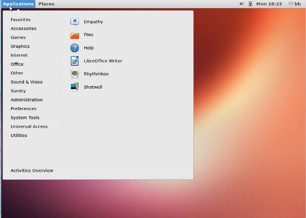
GNOME 3.8 is still a few weeks from release, but with the latest beta, users can view the new GNOME Classic for the first time. The replacement for the retiring fallback mode, GNOME Classic uses extensions to provide something of the GNOME 2 experience — but it is a strangely limited experience that fails to match Linux Mint’s Mate or Cinnamon, as though the GNOME project is reluctant to provide a “classic” experience at all.
GNOME Classic is not included on the beta Live CD. You might find the beta in development directories for distributions such as Fedora or openSUSE, and the option of compiling from source is always available.
However, the easiest way to view it is to download the latest version of Ubuntu 13.04, then use the command sudo add-apt-repository to add ppa:gnome3-team/gnome3 and ppa:gnome3-team/gnome3-staging as sources.
Then running apt-get update followed by apt-get install gnome-shell gnome-shell extensions should add GNOME Classic to the selection of desktops when you log-in. Both these Launchpad sources are in rapid development, so you might have some unexpected problems (in my case, the keyboard stops working if the screen is locked).
A Mixed Record
I would prefer to report that GNOME Classic was an improvement in every way over fallback mode, and that the GNOME project was finally giving its work on GNOME 2 the respect it deserves.
Unfortunately, that would be a half-truth. At best, GNOME Classic is a small improvement over fallback mode, and it remains some distance from the best GNOME 2 experience available on a modern desktop.
You can select GNOME Classic at login, or else switch to it with the command gnome-shell --mode=classic -r, reverting to GNOME 3 with gnome-shell -r. (In my experience, using the command can crash the desktop, but that might be the luck of the nightly release.)
Superficially, GNOME Classic looks similar to GNOME 2. The Application and Places menus are back, although the System menu is not. The panel includes a taskbar with icons, and if not an indicator tray, at least a collection of system icons towards the right. Most applications open in the center of the screen, occupying just over a quarter of the screen space instead of opening maximized as in GNOME 3, and they include traditional title bar buttons for minimizing, maximizing, and closing — a feature that many missed in GNOME 3.
In a couple of cases, GNOME Classic is even an improvement over other GNOME 2 lookalikes. For example, the calendar is large by default and includes any appointments listed for today or tomorrow in a separate column. Similarly, the addition of a menu does not eliminate the activities overview, as Linux Mint’s Cinnamon does. Instead, a link is presented at the bottom of the menu for the overview, so that the desktop is not a complete regression.

GNOME Classic
Unfortunately, these tidbits of promising new features are matched by unwelcome changes. The Application menu is an improvement on the traditional GNOME 2 menu, confined to three columns in a single window instead of having each sub-level spill further across the desktop, but includes no Search field.
Just as importantly, the top-level items are poorly organized. What, for example, is the distinction intended between “Sundry” and “Other”? Or “System Tools” and “Utilities”? For most users, these pairs of menu items sound like synonyms, with other items placed beneath them arbitrarily.
In many fundamental features, GNOME Classic actually fails to match GNOME 2’s standards. On closer examination, the panel proves to be unmovable and un-resizable. Nor has GNOME Classic followed Mate’s lead and restored the ecosystem of applets, the small utilities that could do so much to customize a GNOME 2 desktop.
You can’t place document or application icons on the desktop, either, much less drag them to or from the panel, or drag desktop icons from the menu. Never mind that a third — perhaps closer to half — of users probably prefer desktop icons.
However, by far the greatest weakness is GNOME Classic’s lack of GNOME 2’s pager icon for virtual workspaces. The only way to change workspaces with a mouse is to open the menu and click the link for the activities overview — which otherwise serves no extra purpose. Moreover, while the context menu includes the item “Organize Desktops By Name,” GNOME Classic apparently includes no way to edit, let alone create or display virtual desktops’ names. The result is that virtual workspaces in GNOME Classic are far less convenient than in either GNOME 2 or 3.
A Surprising Decision
GNOME Classic could still be improved before the general 3.8 release. But its mediocre performance in the beta is unexpected. The decision to drop fallback mode was officially taken because bringing it up to quality and maintaining it as a separate code base was seen as too time consuming by the GNOME release team.
However, at the time, I thought it reasonable to assume that GNOME was also aware of the wide disdain for fallback mode. When Slashdot reported the decision, about the kindest description of fallback mode made by commenters was that it was “non-functional.” Many felt that its lack of basic features condemned users who lacked or chose not to use proprietary drivers with 3-D hardware acceleration to a second-class user experience.
Not only that, but Mattias Clasen’s comment that “we should not fault people who prefer the old way” seemed the voice of sanity after GNOME’s apparent reluctance to accommodate those who preferred GNOME 2.
Yet despite these apparent reasons for optimism, GNOME Classic seems scheduled to deliver its own second-class user experience.
GNOME developers are joking when they describe GNOME Classic as “Flintstones mode,” but you don’t need to be an English major to hear overtones of disdain for an obsolescent interface in the term, especially when GNOME 3 is being referred to as “Jetsons mode” in contrast.
At the very least, the intent seems confused when one developer warns users that “nobody tried to restore [the] GNOME 2 experience” in one sentence, then in the next says that the intent was “just to bring some ‘typical’ desktop features in 3.” After all, what is GNOME 2, if not a typical desktop, especially in the minds of those who spent the last year looking for a suitable replacement for it? For that matter, why stop at “some” when the results are unlike to please anyone?
What makes GNOME Classic especially disappointing is that doing better would have been relatively easy. For example, if you go to the GNOME extensions site, you can provide the workspace pager by installing the Workspace Grid extension, eliminating any need for the overview mode, unless you prefer a full-screen replacement for the menu. You can also display names for workspaces by adding Workspace Labels, and add a number of applets to the panel, if not quite as conveniently as in GNOME 2. In many cases, you can find several choices for the same functionality.
In addition, there seems no technical reason why GNOME could not borrow from Cinnamon, which is, after all, a series of modifications to GNOME 3. The result would have been a GNOME Classic that honored the GNOME 2 legacy while making it easy to switch to GNOME 3 and back again any time that a user desired. Yet for some reason, GNOME developers seem at pains to distance themselves from Cinnamon, even though borrowing from it would have helped to improve GNOME Classic without adding significantly to the maintenance.
Experienced users, of course, can improve GNOME Classic with an hours’ browsing on the extension site. However, the result still falls short of Mate or Cinnamon, and newer users are likely to stick with what GNOME Classic installs — and be discontent.
Unless GNOME Classic improves before the general release, it seems destined to be a disappointment. It easily it could be much more. The half-hearted effort remains a puzzle.
-
Huawei’s AI Update: Things Are Moving Faster Than We Think
FEATURE | By Rob Enderle,
December 04, 2020
-
Keeping Machine Learning Algorithms Honest in the ‘Ethics-First’ Era
ARTIFICIAL INTELLIGENCE | By Guest Author,
November 18, 2020
-
Key Trends in Chatbots and RPA
FEATURE | By Guest Author,
November 10, 2020
-
Top 10 AIOps Companies
FEATURE | By Samuel Greengard,
November 05, 2020
-
What is Text Analysis?
ARTIFICIAL INTELLIGENCE | By Guest Author,
November 02, 2020
-
How Intel’s Work With Autonomous Cars Could Redefine General Purpose AI
ARTIFICIAL INTELLIGENCE | By Rob Enderle,
October 29, 2020
-
Dell Technologies World: Weaving Together Human And Machine Interaction For AI And Robotics
ARTIFICIAL INTELLIGENCE | By Rob Enderle,
October 23, 2020
-
The Super Moderator, or How IBM Project Debater Could Save Social Media
FEATURE | By Rob Enderle,
October 16, 2020
-
Top 10 Chatbot Platforms
FEATURE | By Cynthia Harvey,
October 07, 2020
-
Finding a Career Path in AI
ARTIFICIAL INTELLIGENCE | By Guest Author,
October 05, 2020
-
CIOs Discuss the Promise of AI and Data Science
FEATURE | By Guest Author,
September 25, 2020
-
Microsoft Is Building An AI Product That Could Predict The Future
FEATURE | By Rob Enderle,
September 25, 2020
-
Top 10 Machine Learning Companies 2020
FEATURE | By Cynthia Harvey,
September 22, 2020
-
NVIDIA and ARM: Massively Changing The AI Landscape
ARTIFICIAL INTELLIGENCE | By Rob Enderle,
September 18, 2020
-
Continuous Intelligence: Expert Discussion [Video and Podcast]
ARTIFICIAL INTELLIGENCE | By James Maguire,
September 14, 2020
-
Artificial Intelligence: Governance and Ethics [Video]
ARTIFICIAL INTELLIGENCE | By James Maguire,
September 13, 2020
-
IBM Watson At The US Open: Showcasing The Power Of A Mature Enterprise-Class AI
FEATURE | By Rob Enderle,
September 11, 2020
-
Artificial Intelligence: Perception vs. Reality
FEATURE | By James Maguire,
September 09, 2020
-
Anticipating The Coming Wave Of AI Enhanced PCs
FEATURE | By Rob Enderle,
September 05, 2020
-
The Critical Nature Of IBM’s NLP (Natural Language Processing) Effort
ARTIFICIAL INTELLIGENCE | By Rob Enderle,
August 14, 2020
SEE ALL
ARTICLES

