

The best data analytics tools do more than just pull different types of data and help users prepare and analyze them to glean insights. They go beyond the basic functionality, integrating artificial intelligence and machine learning (AI/ML) to streamline data processes with robust workflow automation and transform complex data into actionable information.
We compared the most popular platforms on the market to see how they matched up on key features and prices. Here are our top eight picks for data analytics tools in 2024:
- Tableau: Best for Best for Data Visualizations and Dashboards
- Microsoft Power BI: Best for Microsoft Application Users
- Zoho Analytics: Best for SMBs and Smaller Budgets
- SAS Viya: Best for Collaboration
- Looker: Best for Data Modeling
- Sisense: Best for Data Integration
- Alteryx: Best for Complex Workflows
- Qlik: Best for Discovering Insights
Comparing The Top Data Analytics Tools
The following table shows, at a high level, how the top data analytics tools compare on the essential data analytics features and pricing plans. Note that some providers don’t make their pricing information publicly available.
| Data Management and Processing | Dashboards and Visualizations | Augmented Analytics | Pricing | |
|---|---|---|---|---|
| Tableau | Yes | Yes | Yes (some functions require add-on) | $15 to $75 per user, per month |
| Microsoft Power BI | Yes (some functions require Premium subscription) | Yes | Yes (requires Premium subscription) | Free to $20 per user, per month |
| Zoho Analytics | Yes (some functions require add-on) | Yes | Yes | Free to $30 per user, per month |
| SAS Viya | Yes | Yes | Yes | Contact sales for quote |
| Looker | Yes | Limited (via integration with Looker Studio) | Yes | Starts at $5,000 per month |
| Sisense | Yes | Yes | Yes | Contact sales for quote |
| Alteryx | Yes | Yes | Yes | Starting at $4950 per user, per year |
| Qlik | Yes (limited native processing) | Yes | Yes (requires Premium subscription) | Starts at $825 per month for 20 users |
![]()
Tableau
Best for Data Visualizations and Dashboards
Overall Rating: 4.5/5
- Core Features: 4.9/5
- Cost: 3.8/5
- Security and Compliance: 5/5
- Integrations and Customizations: 5/5
- Ease of Use: 3.8/5
- Customer Support: 3.6/5
Tableau is an AI-powered visual analytics platform that stands out for its robust features and clean interface. Salesforce acquired Tableau in 2019, and this platform has continued to refine and diversify its wide variety of visualizations while releasing new connectors to additional data sources. The ease of adding new data sets to the platform, along with automated insights and dashboard creation tools, makes it a top contender in the business intelligence (BI) marketplace.
Tableau comes in two versions: Tableau Cloud, a cloud-based SaaS (Software as a Service) tool; and Tableau Server, which allows companies to host the software within their IT structure.
Visit Tableau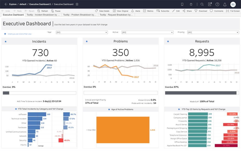
Product Design
Tableau is popular for its visual, straightforward, and drag-and-drop user interface. You can easily hover around Tableau’s workspace, which consists of menus, a toolbar, a data pane, and multiple sheets—which can be worksheets, dashboards, or stories. The workspace’s start page contains the data and analytics pane, which lets you connect to data via the data source tab and the sheets tab, where each sheet in the workbook can be accessed.
Product Development
Tableau recently released Tableau Pulse, a new feature included for all Tableau Cloud customers that delivers intelligent, personalized, and contextualized insights right in user workflows. This development lets organizations integrate data into their daily operations, understand key metrics on the go, and dig deeper into actionable insights.
Why We Picked Tableau
Tableau stands out as a prime option for anyone looking for businesses and data analysts seeking data visualization software. Tableau’s user-friendly interface, AI-powered analytical capabilities, and extensive visualization libraries let you create engaging visualizations, connect various data sources, enable collaboration within teams, and handle complex datasets. While Tableau is considered user-friendly, its breadth of customization might be overwhelming for beginners—for a more straightforward data visualization platform, consider Microsoft Power BI.
Pros And Cons
| Pros | Cons |
|---|---|
| Easy to create visualizations and dashboards | No automatic or scheduled report data refreshes |
| Pre-built connections to a wide variety of data sources, including big data platforms | Breadth of features mean it can be overwhelming for new users |
Pricing
- $15 to $75 per user, per month
- At least one Creator license required for every deployment in the Creator tier
- 14-day free trial available
Features
- Drag-and-drop chart, data visualization, and dashboard creation
- More than 30 connectors to a variety of data sources
- Marketplace of pre-built dashboard extensions
- Self-service data preparation
- Augmented analytics powered by AI/ML, including automated modeling and natural language queries
- Add-ons for data management, embedded analytics, and more
![]()
Microsoft Power BI
Best for Microsoft Application Users
Overall Rating: 4.4/5
- Core Features: 4.5/5
- Cost: 5/5
- Security and Compliance: 5/5
- Integrations and Customizations: 4.2/5
- Ease of Use: 4/5
- Customer Support: 3.4/5
Microsoft Power BI is a suite of business intelligence (BI) tools designed to connect, analyze, and visualize data from multiple sources. The user experience for Microsoft Power BI will feel somewhat familiar to many business users in the Microsoft software ecosystem. Sharing data and reports between Microsoft Power BI and Office 365 applications is seamless, and it is also easy to leverage the power of the Azure SQL database to create reports that identify trends and key performance indicators that drive business growth.
Visit Microsoft Power BI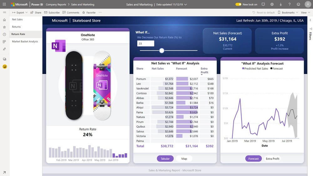
Product Design
Microsoft Power BI is built for data analysts looking for a platform that combines interactive data visualizations, robust data query capabilities, and built-in data modeling. The platform lets you connect, clean, and transform data into a model and create visually appealing reports. You can easily view reports, data, and models through a sidebar and switch between ribbons to pull data from various sources and transform it using the Power Query editor. After preparing the data, you can create and customize reports via the visualization panel.
Product Development
Microsoft Power BI improved its reporting capabilities with new line control features and the new 100 percent stacked area chart, which displays the relative percentage of multiple data series in stacked areas. Power BI also enhanced its Q&A function, which lets users type natural language questions about a semantic model and get responses in the form of visualizations. The latest product enhancement integrates the Copilot-generated linguistic relationships into the Q&A tool to help you interpret questions more effectively.
Why We Picked Microsoft Power BI
We chose Microsoft BI as the ideal analytics tool for Microsoft users as it effortlessly integrates with other Microsoft products like Excel, SharePoint, and Teams, ensuring easy data sharing and collaboration. Power BI also offered various tiered licensing options targeted at individual users, small teams, growing businesses, and large enterprises. However, you’ll need to pay extra for robust customer support. If you’re looking for more responsive support solutions, try Qlik instead.
Pros And Cons
| Pros | Cons |
|---|---|
| Deep integration with other Microsoft products | Add-ons required for data sharing and working with larger datasets |
| Hundreds of pre-built visualizations available on Microsoft AppSource | Data refresh limitations with lower-priced packages |
Pricing
- Free to $20 per user, per month
- 60-day free trial
Features
- Customized dashboards and interactive visualizations
- Access to hundreds of data connectors
- Self-service data preparation and modeling tools for Premium package subscribers
- AI-powered augmented analytics for Premium package subscribers
- Natural-language search
![]()
Zoho Analytics
Best for Small and Budget-Conscious Businesses
Overall Rating: 4.4/5
- Core Features: 4.4/5
- Cost: 4.7/5
- Security and Compliance: 5/5
- Integrations and Customizations: 4.5/5
- Ease of Use: 4/5
- Customer Support: 3.6/5
Zoho Analytics is an easy-to-use self-help analytics platform with pricing that won’t break the bank for SMBs and enterprises with lower data volumes. It provides a modular approach to data analytics so that it can grow as data programs mature. The tool has a range of data connectors and integration options and can connect with both cloud-based and on-premises data sources. Some of the more technical data analytics features require a premium subscription or add-on software.
Visit Zoho Analytics
Product Design
Zoho Analytics features a clean and intuitive interface that enables users to simplify data exploration and analysis. You can connect to multiple data sources ranging from spreadsheets to CRM systems and social media platforms. Zoho’s drag-and-drop interface also allows users to easily create reports and dashboards and choose from pre-built visualization and analytical functions.
Product Development
Zoho Analytics’ recent product enhancements include new features for its reports, dashboards, and forecasting tools. You can now comment on dashboards, letting you easily collaborate with your team and make decisions on the go. You can also access more dynamic insights from Zia AI based on legend filters, enabling you to delve deeper and pull insightful information based on the area, category, or interest. Additionally, you can now present forecasted values on dashboard widgets to get a better understanding of how close you are to achieving key performance indicators (KPIs).
Why We Picked Zoho Analytics
Zoho Analytics offers a compelling value proposition for small and budget-conscious businesses for its affordability, user-friendly interface, and scalability. Zoho offers a free plan for its on-premise version that’s ideal for startups and small businesses, and its paid plans are more cost-effective compared with enterprise BI solutions on the market. Additionally, non-technical users can leverage its drag-and-drop functionality to quickly use the platform, while growing businesses can add more features and data storage capacity as they scale.
Zoho Analytics is an ideal option for startups and SMBs, but it has fewer visualization options than its competitors. For a data analytics platform with extensive visualization options and a free platform, look into Tableau.
Pros And Cons
| Pros | Cons |
|---|---|
| User-friendly dashboard and report creation | Limited data visualization options |
| Scalable and modular solution that can grow with your business | Online reviews say that training videos and resources could be improved |
Pricing
- Cloud version starts at $24 per user, per month
- On-premise version is free to $30 per user, per month, with a minimum of five users
Features
- Integrations with more than 250 data sources
- Data preparation and management via Zoho DataPrep app (available with Premium subscriptions)
- Collaboration tools for reports
- Ask Zia natural language queries
![]()
SAS Viya
Best for Collaboration
Overall Rating: 4.1/5
- Core Features: 4.5/5
- Cost: 1.3/5
- Security and Compliance: 5/5
- Integrations and Customizations: 4.7/5
- Ease of Use: 4.5/5
- Customer Support: 3.7/5
SAS Viya is a comprehensive cloud-native data analytics platform that leverages SAS’s industry-leading analytic expertise and the power and security of Azure. The platform is highly scalable and offers numerous connections with other tools and systems to extend its functionality. SAS Viya integrates functionalities such as data management, analytics, and AI into a unified environment, letting you analyze and visualize data seamlessly.
Visit SAS Viya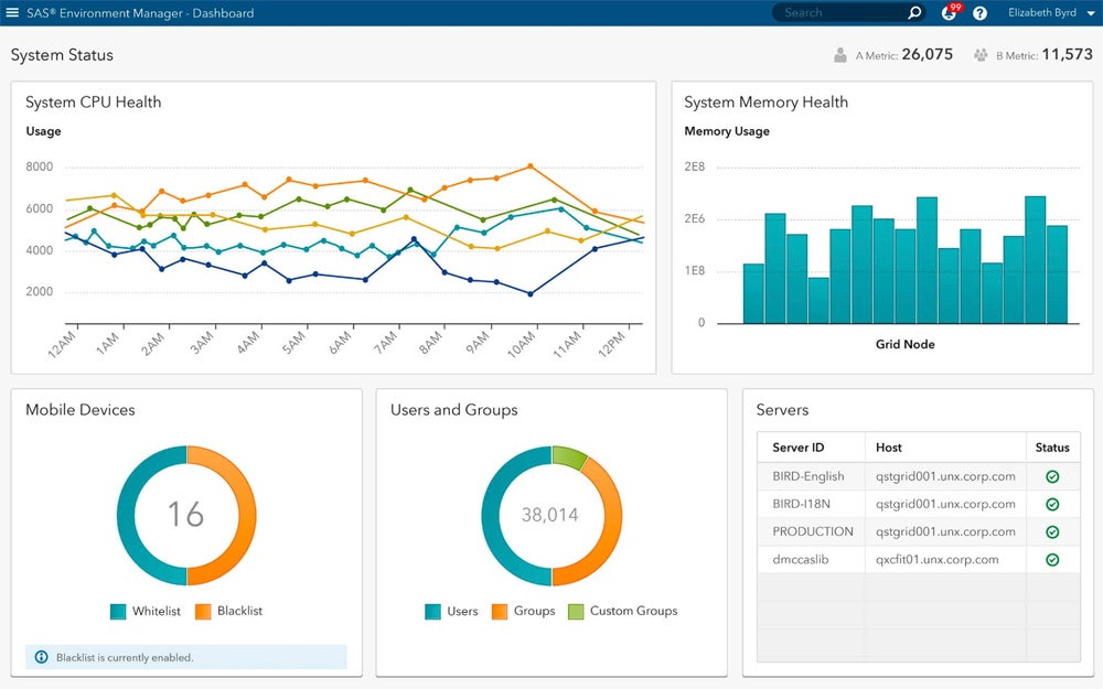
Product Design
SAS Viya boasts a modern and intuitive design that emphasizes accessibility and ease of use. You can run SAS programs on SAS Viya without the need to recode and can create new projects on the cloud-based platform. This platform is also built to be elastic and scalable for both private and public clouds, allowing you to quickly experiment with different scenarios and explore approaches to increasing amounts of data.
Product Development
SAS announced the general availability of SAS Viya Workbench for building AI models, an enhancement that facilitates rapid SAS or Python coding in a cloud-native and scalable environment. Developers and modelers can use Viya Workbench’s self-service feature and capabilities to conduct data prep, exploratory data analysis, and develop analytics and machine learning models.
Why We Picked SAS Viya
SAS Viya fosters collaboration within teams by providing features like shared workspaces, version controls, and real-time updates, allowing users to easily work together on data exploration tasks. You can also sync SAS Viya to popular communication tools, which further facilitates team discussions and knowledge sharing. However, SAS Viya’s pricing isn’t publicly available, and customer reviews mention that the software is expensive. For a collaborative data analytics tool with affordable pricing, try Zoho Analytics.
Pros And Cons
| Pros | Cons |
|---|---|
| Cloud-native architecture allows access to data from anywhere | Cost isn’t upfront and transparent |
| Easy to share and collaborate on dashboards and visualizations | Limited support options and training |
Pricing
- Contact sales for quote
- 14-day free trial
- Free educator and student access to SAS Viya for Learners
Features
- Data preparation and cataloging
- Model deployment and monitoring
- Conversational AI
![]()
Looker
Best for Data Modeling
Overall Rating: 4.1/5
- Core Features: 4.4/5
- Cost: 2/5
- Security and Compliance: 5/5
- Integrations and Customizations: 4.7/5
- Ease of Use: 4/5
- Customer Support: 3.3/5
Google Looker is a browser-based data analytics tool built on the Google Cloud infrastructure. A full-featured platform, Looker’s proprietary LookML modeling language provides a flexible approach to building complex data models. LookML lets you create reusable code blocks and data models, streamlining the modeling process. Its integration with Google Looker Studio allows you to create and share a wide variety of dashboards and visualizations.
Visit Google Looker
Product Design
Looker lets you build custom data experiences and apps with its robust embedded analytics capabilities. You can leverage its fully interactive dashboards, which can sync into various applications, and use its API coverage to tailor the interface according to their needs. Looker’s extensions also connect directly with Vertex AI, which lets you create and customize AI-powered workflows and harness advanced analytics capabilities.
Product Development
Looker has recently introduced Gemini (formerly known as Bard) into the platform, bringing Google’s Generative AI capabilities. With Gemini in Looker, you can use conversational data analytics to engage with business data, such as finding top products, delving into sales details, and exploring the answers with follow-up questions.
Why We Picked Looker
Looker stands out in data modeling as LookML (Looker Modeling Language) allows data analysts to separate data transformations and security measures from visualizations. This separation provides simplified data governance, allowing LookML models to ensure consistency and data integrity across the organization. Additionally, LookML models can also handle data from multiple sources, making Looker flexible and adaptable to complex data landscapes.
While Looker is best suited for data modeling, its steep learning curve might be overwhelming for those who aren’t experienced with LokkML or SQL. For a data analytics tool with a more user-friendly data modeling approach, consider Alteryx.
Pros And Cons
| Pros | Cons |
|---|---|
| Can build complex data models | High price tag |
| Integrations with numerous data sources | Learning curve for users who are not experienced with LookML or SQL |
| Advanced data governance and security features | Reported slowness when working with large data sets |
Pricing
- Starts at $5,000 per month
- 30-day free trial (Looker Studio Pro)
Features
- LookML modeling language, which abstracts SQL queries
- Dashboards and visualizations via an integration with Looker Studio
- Predictive modeling and machine learning
![]()
Sisense
Best for Data Integration
Overall Rating: 4.1/5
- Core Features: 4.8/5
- Cost: 1.1/5
- Security and Compliance: 4.8/5
- Integrations and Customizations: 4.4/5
- Ease of Use: 4.5/5
- Customer Support: 3.8/5
Sisense is a BI tool that brings together disparate sources of data to create useful interactive dashboards and visualizations that can be drilled down into to expose actionable insights. These reports can then be embedded in a wide range of applications. Sisense is built as a cloud-native product but can also be run on-premises or as a hybrid solution.
Visit Sisense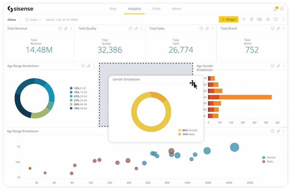
Product Design
Sisense integrates seamlessly with various data sources, including databases, cloud applications, files, and more. You can easily navigate through the platform with its drag-and-drop interface and dashboard exploration tools. After importing your data into Sisense, you can create dashboards via the analytics page, where all existing dashboards are displayed.
Product Development
Sisense has recently announced the availability of Compose SDK for Fusion, a software developer toolkit enabling developers to customize their data experiences. This code-first toolkit lets developers use Sisense’s API-first analytics platform for creating dynamic queries, charts, filters, and more.
Why We Picked Sisense
Sisense allows you to connect to a wide range of data sources to seamlessly integrate data from various databases and cloud applications. You can also connect to various unstructured data sources, including social media feeds, medical records, and business documents. Sisense’s powerful in-memory analytics engine also lets you work with large datasets quickly and efficiently, making the platform a valuable tool for businesses that need to make data-driven decisions in real-time.
While Sisense is a robust data integration tool, it might be too costly for small businesses. For a more cost-effective data analytics tool with comprehensive data integration capabilities, try Microsoft Power BI.
Pros And Cons
| Pros | Cons |
|---|---|
| Connects to a wide variety of data sources | Reports of performance issues when working with extremely large data sets |
| Drill-down charts and dashboards | Significant learning curve for new users |
Pricing
- Contact sales for quote
- Free demo available
Features
- Data blending tools to merge data from disparate sources
- Interactive dashboards and visualizations
- AI-driven insights
- Embeddable in a wide variety of applications
![]()
Alteryx
Best for Complex Workflows
Overall Rating: 4.1/5
- Core Features: 4.3/5
- Cost: 2.5/5
- Security and Compliance: 4.5/5
- Integrations and Customizations: 4.7/5
- Ease of Use: 4.6/5
- Customer Support: 3.2/5
Alteryx is a leading data analytics and visualization platform designed to simplify data preparation, blending, analysis, and visualization tasks. This platform is a valuable tool for data analysts and business users who need a platform with self-service analytics and advanced manipulation capabilities. Alteryx stands out as an automation tool for the data analytics process, working similarly to SQL (structured query language) and ETL (extract, transform, and load) tools but in a more user-friendly way.
Visit Alteryx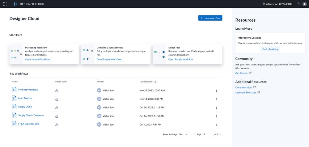
Product Design
Alteryx stands out for its user-friendly and visually intuitive product design. The platform’s drag-and-drop interface allows you to easily navigate between data sources, data transformation tools, and visualization elements, and Alteryx’s Designer Cloud lets you create new workflows and connect to any data source using the data pipelines available in the dashboard. You can highlight data records through Alteryx’s AiDIN, which produces AI-powered data transformation suggestions with a single click.
Product Development
Alteryx recently announced plans to include AiDIN Copilot in Designer, helping users enhance their workflows by automatically adding tools to the canvas and offering insights. AiDIN makes use of generative AI to analyze data and help you find the best solutions for improving workflows. It also helps in streamlining workflows by automating repetitive tag-and-top tasks and setting configurations.
Why We Picked Alteryx
Alteryx is best-suited for data analysts and business users who need to develop complex workflows because it provides access to a wide range of tools for creating the automation they need. You can also quickly generate insights and find the best tool for your workflows with the Alteryx AI tool. Additionally, Alteryx offers robust data governance, ensuring data quality and compliance for handling sensitive information and a vast amount of data.
However, Alteryx is quite expensive compared to other data analytics tools on the market. If you’re looking for a more affordable tool for automating complex workflows, try Tableau.
Pros And Cons
| Pros | Cons |
|---|---|
| Easy to understand UI; no coding required | Can be expensive; requires to purchase a minimum amount of licenses |
| Plenty of customization options for workflows | Limited customer support options |
Pricing
- Starting at $4,950 per user, per year
- Requires minimum of three user licenses
Features
- Data analytics automation
- Code-free or code-based interface
- Easy data integration
- Spatial and predictive analytics
- Assisted data modeling
![]()
Qlik
Best for Discovering Insights
Overall Rating: 4/5
- Core Features: 4/5
- Cost: 2/5
- Security and Compliance: 5/5
- Integrations and Customizations: 4.7/5
- Ease of Use: 3.6/5
- Customer Support: 4.6/5
Qlik is a data analytics and BI platform that uses an AI-powered associative engine to import data from different sources to speed up the process of combining the data and uncovering new actionable insights. You can harness Qlik’s AI capabilities to implement generative models, create data-driven decisions, and improve business outcomes.
Visit Qlik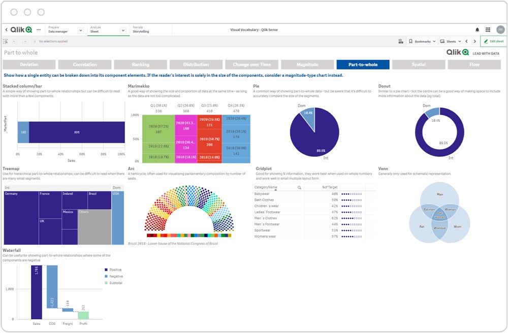
Product Design
You can use Qlik Sense Enterprise as a starting point for creating, developing, publishing, and consuming applications, and navigate through Qlik’s overview page to see all the content the app contains, such as sheets, stories, and bookmarks. You can also use the data manager to load and manage data sources to get an overview of the data you’re loading in the app. You can visualize and weave this data into compelling stories for discoveries and insights.
Product Development
Qlik Sense has recently improved its features focused on visualizations, connectivity, and the ability to preload apps. As a result, you now have more options to style dashboards and use enhanced buttons for easier navigation. Qlik also improved its existing capture methods with support for SAP ODP, which enables data capture from multiple data sources, including Extractors, CDS views, BW objects, and SAP HANA Information views.
Why We Picked Qlik
We chose Qlik because of its ability to allow users to explore data freely with its unique associative engine that fully combines data sources without data loss or inaccuracy. Qlik’s associative engine also allows you to make selections and surface connections and patterns across your data instantly, which you might miss when done manually. Additionally, Qlik is constantly innovating and developing new products and features, ensuring that you are accessing updated and comprehensive data analytics tools.
While Qlik is a powerful tool for discovering insights, it can get costly when you need to scale up your operations. For a more affordable platform with a robust insight-discovery tool, look into Zoho Analytics.
Pros And Cons
| Pros | Cons |
|---|---|
| Associative engine streamlines data processing | Can get expensive quickly when you need to scale up the number of users |
| Automated workflows | Mobile-optimized design means some charts are lower resolution |
Pricing
- Starts at $825 per month for 20 users
- 30-day free trial available
Features
- ML-powered augmented analytics with intelligent alerts
- Interactive charts and visualizations
- Mobile-first design with iOS and Android apps
7 Key Features of Data Analytics Tools
The market of data analytics platforms is broad, and there are tools to fit just about every business need. While each has its own strengths and weaknesses, there are a number of key features they all need to meet.
Data Management
Data management refers to the process of gathering, storing, securing, and using data within an analytics platform. It is helpful for the software to be able to bring in and use different types of data from a variety of sources.
Data Preparation
Data preparation is the process of cleaning and reformatting data before it is used for analysis. The quality of your data directly impacts the quality of your analysis—as the saying goes, ”garbage in, garbage out.”
Data Modeling
In data modeling, a platform helps define the different types of data you collect and spells out the relationships between these disparate datasets.
Data Governance
Data governance helps insure the quality and security of your data through a set of defined standards and policies. Data analytics platforms help data governance efforts by automating and monitoring these standards and policies.
Dashboards and Visualizations
Dashboards and visualizations are the most useful tools for communicating the insights uncovered in your data with non-technical business users. Dashboards help businesses monitor their key performance indicators and other important metrics, while visualizations can help convey important insights at a glance.
Scalability
As a business grows, so too does the amount of data it collects and needs to analyze. That’s why scalable data analytics platforms are important, so they can grow with your business as your data grows.
Security
Because much of the data businesses collect is sensitive or proprietary, data analytics platforms need to have robust security controls to prevent theft or misuse of their data. This includes features such as granular access controls, end-to-end encryption, and logging and audit tools.
How I Evaluated Data Analytics Tools
To assess the top data analytics tools, I scored each option based on six criteria essential for businesses and organizations looking for robust analytics solutions. Then, I determined the weighted subcriteria for each category and assigned a total score out of five. After identifying the criteria and subcriteria weights, I totaled the final scores to evaluate the winners for each category and assign their respective use cases.
Evaluation Criteria
I put the highest weight on core features, security, and compliance, as top solutions should offer fundamental functionalities for data analytics processes as well as adhere to legal and industry standards. Then I assessed the cost of each data analytics tool, followed by integrations and customizations, ease of use, and customer support.
Core Features | 30 percent
Here, I looked into the standard offerings of each data analytics platform, including data management, workflow automation, data visualization, and AI/ML capabilities.
Criteria Winner: Tableau
Security and Compliance | 20 percent
I considered how data analytics platforms encrypt their data to follow compliance standards such as SOC Types 1 and 2, ISO 27001, GDPR, and CCPA.
Criteria Winner: Multiple Winners
Cost | 15 percent
I assessed each option’s pricing plans, such as the cost for starting and enterprise tiers, free trial length, and/or free forever plans. I also looked at each data analytics solution’s billing options and pricing transparency.
Criteria Winner: Microsoft Power BI
Integrations and Customizations | 15 percent
I evaluated how data analytics platforms tailor data sources, reports, dashboards, and user access to their needs, as well as how they integrate with APIs and third-party apps.
Criteria Winner: Tableau
Ease of Use | 10 percent
Data analytics tools should be user-friendly, intuitive, and well-documented. For this category, I considered real user reviews from credible sites and each option’s knowledge base.
Criteria Winner: Alteryx
Customer Support | 10 percent
This covers the various support solutions each platform offers such as live chat, phone, and email. I also looked into user feedback and ratings from reliable sites to wrap up my assessment.
Criteria Winner: Qlik
Frequently Asked Questions (FAQs)
What Should I Consider Before Purchasing a Data Analytics Tool?
When selecting a data analytics tool, the primary consideration is how you will use it. Aside from the cost, usability, and support solutions each tool offers, delve deeper into the following data analytics functions:
- Data Handling: Platforms also differ in their ability to handle large datasets or to ingest data from a variety of sources. If your data is spread across multiple systems, look for a platform with a wide variety of data connectors. If your business deals with big data, be sure to read reviews of the software you are considering to see if there are any performance issues when dealing with large datasets.
- Data Preparation: Data analytics software varies in its ability to tackle data preparation tasks. Some software requires add-ons or integrations to clean and prepare data, while others are able to do these tasks natively. As your data grows more complex, you will need to look for a platform that can handle a variety of data models and easily manage complex models.
- Data Governance: Similarly, as the complexity and volume of data grows, look for a platform that includes data governance functions that let you implement policies and practices and monitor your data to ensure compliance.
Should I Select a Desktop or Cloud-Based Data Analytics Solution?
Data analytics platforms can often be hosted in a variety of environments, from the cloud to on-premises to hybrid, but many of the tools have differences in how they function on a desktop versus in a cloud environment.
In addition, while cloud-hosted services do offer enterprise-level security, you may still need to have an on-premises-hosted solution, depending on the data you collect or the way your IT is governed. You also need to think about your maintenance and support resources when making a hosting decision, as well as your backup and recovery capabilities.
What Are Common Types of Data Analytics Tools?
There are numerous types of data analytics tools on the market, and the boundaries between them can be somewhat blurry, as many can be used for a variety of industries and tasks. Examples of how some companies are using these tools to transform their operations and services can easily be found online. Here are some of the common types of data analytics tools:
- Business Intelligence: Many data analytics tools are business intelligence tools, focused on bringing your data together for the purpose of better understanding your market and for making strategic business decisions. Business intelligence tools can also be used in education, healthcare, and IT settings to optimize service delivery to students, patients, and clients. Most BI platforms have robust dashboards and data visualization capabilities so that the data can be accessed and understood by a wide variety of stakeholders.
- Data Science: Similar to BI platforms, data science platforms are often used by companies looking to transform their data. Many of the new data science platforms use machine learning to develop models for activities like predictive analytics.
- Statistical Analysis: Researchers, economists, scientists, students, and engineers need workhorse platforms to do deep statistical analysis of data. These programs include popular statistical analysis models, like regressions and Bayesian procedures.
- Collaboration: While other types of data analytics platforms facilitate collaboration between users, there are some products on the market specifically designed for data scientists to collaborate with each other. These platforms allow users to share notebooks, code, and data to help with workflows.
Bottom Line: Top Data Analytics Tools and Software
The universe of data analytics platforms is vast and diverse, which means that there are numerous tools available to fit your company’s individual needs. The best data analytics tools will provide a robust set of tools and security for your data processes, as well as ease of use to manage the platform. Read our independent review of the top data analytics solutions, seek advice from professionals and peers, and sign up for free trials or demos before deciding on the right software for your business or organization.
Do you want to know more about the various methods to help you use your data more effectively and create data-driven decisions? Read our guide on the top data analytics techniques to help you gain an advantage in the field.