Datamation content and product recommendations are
editorially independent. We may make money when you click on links
to our partners.
Learn More
Software dashboards are critical instruments that help enterprise users grasp large datasets, glean hidden insights, monitor operations in real-time, and make predictions to gain a competitive edge. From business intelligence platforms to data visualization tools, the leading dashboard solutions on the market are geared for facilitating data-driven decision-making and analysis using familiar visual elements and compelling interfaces. We compared the most popular dashboard software solutions on the market to see how they stack up across various feature sets and benefits—here are our top picks:
In evaluating the top dashboard solutions, we considered five key, composite elements: pricing, core features, vendor profile, support, integrations, and additional features.
Our list of top dashboard software solutions ranges from barebones data visualization tools for quickly charting graphic data to fully-fledged enterprise business intelligence (BI) platforms with sophisticated data analytics and visuals. Here’s a more detailed look at each of our 10 picks.
Featured Partners: Dashboard Software
We are able to offer our services for free because some vendors may pay us for web traffic or other sales opportunities. Our mission is to help technology buyers make better purchasing decisions, so we provide you with information for all vendors — even those that don't pay us.
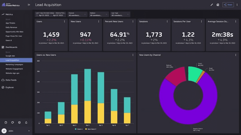
Previously known as Google Data Studio, Looker Studio is Google’s re-imagined dashboard solution for building visually compelling reports, dashboards, and informative data visualization elements. The tool brings together previous Data Studio features with Looker’s new business intelligence capabilities under the same platform, with integrated core Google technologies such as artificial intelligence and machine learning (AI/ML).
With more than 800 different data sources and more than 600 data connectors, Google Looker Studio is the ideal tool for syncing all your organization’s data sources into a streamlined, unified reporting interface. The solution also comes with its own modeling language, LookML, for creating semantic data models.
Free and paid (Pro) versions—different licenses for Viewer, Standard, and Developer users ($30-125 per user, per month)
Features
Integration with Google Sheets
Support for more than 50 SQL databases
LookML modeling language for creating semantic data models
Easy-to-use merging capability for different data sources
Pros
Full-featured free version
Many available templates, data sources, and integrations
Seamless interoperability across Google’s Suite
Cons
Developer license is expensive
Only Pro version offers additional collaboration capabilities for larger teams
Add-on integrations priced individually (can get expensive if using many add-ons
Tableau: Best for Built-In Analytics
A veteran dashboard developer, Tableau and its data visualization platform were acquired by enterprise cloud CRM giant Salesforce back in 2019. Since then, the product has continued to dominate in the data visualization market category.
For Salesforce users, this is a clear win-win. Tableau’s native Salesforce connector allows for a streamlined Salesforce-to-Tableau integration. On its own, Tableau’s powerful real-time data visualizations have for years made it a go-to for advanced graphical capabilities—a reputation it continues to hold to this day.
Viewer, Explorer, and Creator subscription levels ($15-70 per user, per month, billed annually)
Features
Powerful, high-performance analytic engine for gleaning insights from cloud and relational databases, spreadsheets, OLAP cubes, and more
In-memory data connections to both live and external data sources
Desktop and online versions available
Advanced security with Active Directory and Kerberos
Pros
Streamlined Salesforce integration
User-friendly interface designed for non-developer users
Advanced visualization capabilities and pre-installed map data
Works well in both desktop and mobile versions
Cons
Relatively high cost (and no unlimited free version)
Lack of full-fledged business intelligence tools (e.g, large-scale reporting, static layouts)
Steep learning curve for non-analyst users
Klipfolio: Best for Third-Party Connectors
Klipfolio’s Software-as-a-Service (SaaS)-based dashboard and visualization platform is well-regarded for its wide array of pre-built dashboard options and clear, customizable visualization components derived from myriad data sources. The solution makes it easy to automate reporting capabilities, as well as integrate a broad enterprise toolset into the platform’s dashboards.
Free and paid (Go, Pro, and Business Tiers at $90-800 per month)
Features
Over 100 pre-built connectors and data connectivity to on-premises servers, spreadsheets, and cloud servers/assets
Data visualizations/dashboard sharing via multiple messaging and social media platforms
Custom data visualization tools like scatter plots, graphs, and charts for creating hyper-personalized dashboards
Pros
Intuitive, easy-to-understand user interface
Easy automation of data tracking, consolidation, and visualization for non-technical users
Impressive visualizations and charting capabilities
Cons
10 MB limit on Klipfolio data sources
Building customized reports (outside of predefined options) requires significant technical expertise
User interface lacking in some customizable elements
Larger datasets can cause performance issues
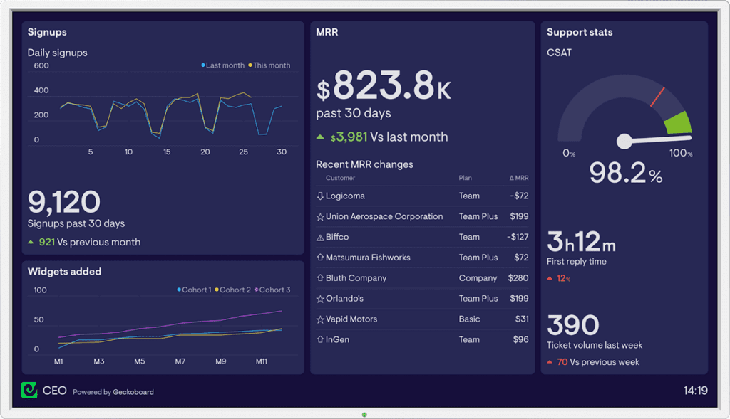
Geckoboard: Best for Multi-Channel Sharing
Geckoboard has established a reputation over the years for being a simple, no-nonsense tool for building and sharing business dashboards. The solution’s built-in widget and template library enable users to create visually compelling, insightful dashboards in a short amount of time, and the data visualization tool is especially adept for real-time tracking/monitoring/analysis of key performance indicators.
Geckoboard’s customizable interface can pull in over 100 data sources, including Salesforce, Tableau, Google Analytics, and Microsoft Power BI, to name a few—all without special coding or developer support.
Essential, Pro, and Scale Tiers ($39-559 per month). Limited 14-day free trial available.
Features
Simple drag-and-drop dashboard editor
Wizard assistant feature for quickly building effective visuals
Multi-channel dashboard sharing/viewing via Slack, email, or any web browser
Interesting “Send-to-TV” feature for creating freestanding dashboard kiosks
Pros
Easy to configure and get up to speed with
Cost-effective option for SMBs and individuals
Live, in-browser support
Cons
Limited in-built analytics
Lack of fine tuning and adjustments (e.g., for displaying data fields)
Lacks more advanced features like ad-hoc reporting
Databox: Best for Pricing Options
Databox is known for its powerful features for tracking and creating dashboards against high-level metrics, allowing for the contextualization of multiple data sources into a unified context. Of all the solutions reviewed, Databox offers the widest range of pricing options, including a free, non-expiring tier for rudimentary use cases.
Offers four pricing tiers ($47-700 per month), with free option
Features
Reports interface is intuitive and easy-to-use for both self-service and standard reports
Wide range of built-in chart and graph formats
Score cards let you visually track key performance indicators (KPIs)
Pros
Unlimited (free forever) version available
Controls are customizable
Excellent mobile app
Cons
Setup is involved and can take time
Historical data limitations
Qlik: Best for a Wide Range of Use Cases
The QlikView platform has long been a favorite of data professionals working in a variety of industries, from accounting and IT to healthcare and pharmaceuticals. Now known as Qlik Sense, the leading business intelligence platform is ideal for enterprises looking to access powerful analytics, interactive dashboards, and sophisticated business intelligence and data analysis capabilities.
Some reported performance issues with large datasets
Limited pricing options (enterprise can be costly)
Solution can be challenging for non-technical users, despite visual tools
Limited number of data sources
Microsoft Power BI: Best for Pricing
It’s safe to say that most business users are familiar with Microsoft Power BI. As the leading data visualization and business intelligence solution by market share, Power BI has a massive footprint across myriad industries and organization types, from SMBs and enterprises in the private sector to government and educational institutions.
$10 per user for Power BI Pro; $20 per user for Power BI Premium; $20 per user or $4,995 per month per Power BI enterprise
Features
Customizable dashboards and tiles
“Ask a Question” natural language search
Azure ML-powered features and integration
Microsoft Data Analysis Expression (DAX) Library—more than 200 functions in the Power BI function library
Pros
Seamless integration with the Microsoft Ecosystem (e.g., Excel, PowerApps, and SharePoint)
Easy to create highly interactive and engaging reports, dashboards, or graphics from Excel files, SQL databases, BI warehouses, Cloud data, APIs, web pages
Cost-effective option for individual and professional users
Cons
Limited data sharing capabilities
Some performance issues with handling large data sources
May not be suitable for large/complicated data sets or real-time analytics
Metabase: Best for Ease-of-Use
Like a few of the offerings already covered, Metabase is an open source solution for querying and visualizing data sourced from a data pipeline or warehouse. The streamlined platform is known for its ease-of-use and low learning curve, with most tasks and configurations carried out via drop-and-drop interactions—no SQL required.
Starter to Pro tiers ($85-500 per month); Enterprise also available (custom pricing, starts at $15,000 per year)
Features
Easy monitoring/alert setup
Customizable “on-click” dashboard behaviors for creating unique interactions
Data instruments like a customizable data dictionary and editing tools for metadata curation
Pros
Low learning curve and highly accessible for non-technical users
Clean, easy-to-understand user interface
Data project collaboration features for sharing visualized data across different teams
Cons
No ad-hoc reporting and benchmarking
Lacks advanced analytics capabilities
More expensive than competing solutions
Amazon Quicksight: Best for AWS Cloud Infrastructures/Services
Compared to the other solutions on this list, Amazon QuickSight is a relatively new contender in the dashboard and data visualization arena; that said, native integration within AWS’ environment makes it a rising favorite among AWS cloud’s massive user base.
Standard edition, $9 per user, per month; Enterprise edition pricing per user type (e.g., authors, readers)
Features
One-click public embedding for coding/development-free embedding of dashboards into public applications, wikis, and portals
Built-in integration with QuickSight Q, AWS’ ML-powered business intelligence service
Includes Amazon’s super-fast parallel in-memory calculation engine (SPICE) for quickly querying large datasets
Pros
Advanced dashboard capabilities via seamless integrations with other AWS services (e.g., Amazon CloudWatch for real-time monitoring of QuickSight assets)
Highly scalable for enterprises with an expansive cloud-based data estate and large data consumer/user base
Support for virtually any internet-accessible database or data source
Cons
Limited visualization capabilities—even with its built-in visualization engine
Moderate selection of basic charts and graphs
Limited amount of embedded analytics
Grafana: Best for Data Visualizations
True to its open source roots, Grafana’s data visualization platform is available for free download or as a SaaS-based cloud application; in the case of the latter, a “free forever” access tier allows for free perpetual use of a scaled-down version of the full-blown solution.
Free Forever, Pro and Advanced Tiers ($29 per month and $299 per month)
Features
Robust monitoring and alert management system
Automated PDF and email-based reports
Robust data security and governance capabilities to meet compliance requirements (e.g., SOC2, ISO 27001, PCI, GDPR, CSA, HIPAA)
Load testing capabilities using Grafana K6, an open-source tool and cloud service for testing performance at scale
Pros
Easy-to-use, intuitive user interface and powerful visualizations
Plugins available for hooking up virtually any storage array or operating system
Streamlined alert and notification workflow with built-in integration to collaboration channels
Cons
Adaptive alerts and capacity planning via Grafana ML only available in Pro/Advanced versions
Deeper customizations require technical expertise and programming (e.g., JSON, SQL)
Data storage not included in the cloud service
Dashboard Software Evaluation Criteria
We considered five key composite criteria when evaluating dashboard solutions: pricing, core features, vendor profile, support, and integrations. We also considered additional features. Percentages represent the weight of the total score for each product.
Core Features | 20 Percent
Of course, a dashboard software’s primary purpose is to provide data-driven visualizations—its visualization capabilities are therefore a critical measure of its core feature set. Other core feature considerations include the breadth of its built-in chart/graphic component library, the degree to which its user interface (UI) is customizable, collaboration features such as social sharing, and built-in analytics (if any).
Pricing | 20 Percent
In evaluating the top ten dashboard software solutions, pricing considerations include the advertised cost, the price of add-ons and options, available pricing tiers, any upgrades or discounts, and whether a free tier and/or trial version is available.
Vendor Profile | 15 Percent
Several attributes of the vendor’s profile are important when your organization’s data is on the line. We considered the size and name recognition of the vendor’s customer base, the vendor’s length of time in business, its business type (e.g., new startup or established software player), the breadth of its product suite, and reputation (e.g., data breaches, privacy incidents, acquisitions).
Support | 15 Percent
In a perfect world, hooking up your data and pressing a button would yield impressive dashboards and visualizations out of the gate. Unfortunately, software solutions can pose many difficulties, and a competent dashboard solution should offer numerous customer support options. These include email, live chat, self-service options (e.g., knowledgebase, service outage dashboards), as well as phone/premium support.
Integrations | 15 Percent
No software is (or should be) an island entirely to itself. A dashboard solution should offer ample plugins and/or a component library, as well a lively ecosystem of third-parties, developers, and related resources. Further, the components and plugins should provide a reasonable degree of usability and utility.
Additional Features | 15 Percent
Aside from core features, additional features help to bolster/strengthen the overall dashboard offering—for example, built-in social functionality and sharing allow for the easy dissemination of your visualizations. Additionally, AI/ML-powered functionality (if any), regularity and cadence of software updates, and the availability of an on-premises option are also key additional features.
Key Features of Dashboard Software and Tools
Dashboard software solutions can vary drastically in terms of their functionality and relative strengths/weaknesses. For example, some lean toward a more barebones graphing/charting solution with minimal connectors, while others are full-blow business intelligence platforms capable of generating powerful visual analytics.
Generally, the following are key features of dashboard software to focus on when evaluating potential solutions:
Built-In Analytics
A crucial feature that most—but not all—dashboard solutions offer is built-in analytics: this could range from simple, automated custom report generation to advanced insights driven by AI/ML. Keep in mind that larger cloud-based offerings like Tableau and Amazon QuickSight more often provide integrations to both native and third-party analytics engines and machine learning services.
Visualization Library and Templates
By and large, users are looking to get up-and-running as fast as possible to maximize ROI. Candidate desktop solutions should offer a library of pre-built visualization templates to draw from; this allows for the shortest time to value when it comes to creating the most commonly used visualizations and reports.
Data Sources and Plugins
Like pre-built templates, the more data sources and plugins the better—however, in this case, more data sources and plugins mean better connectivity to external and/or disparate data sources, allowing for richer context and deeper insights. Be sure to verify that the potential dashboard solution offers plugins and connectors to your specific data sources.
Data Security and Management
Data security and management should always be top-of-mind when it comes to dashboard software. However, these concerns may be more or less relevant depending on the solution and use case. For example, some solutions offer no data storage, while others offer both an on-premises and cloud version (storage inclusive). Firms that must comply with strict customer or legal requirements for data should evaluate dashboard solutions with more comprehensive data security and governance capabilities.
Subscription Plans and Options
Aside from the handful of on-premises dashboard solutions, most of the offerings covered previously are subscription-based and offer various tiers/levels. Ideally, the potential dashboard solution(s) will offer a range of plans to suit your business requirements.
Frequently Asked Questions (FAQs)
Do dashboard software offer DIY and build-your-own integrations with third-party applications?
Yes, but many solutions allow you to get up-and-running quickly with built-in connectors. BI users and analysts aren’t necessarily developers, and may not know how to (and arguably shouldn’t) write code to build dashboards.
Are dashboard software options suitable for both small businesses and enterprises?
Yes, but enterprises should select a dashboard solution with more in-built analytics and extensive visualization capabilities. Larger organizations are likely to have more diverse datasource requirements across their data estates.
How secure are the data and insights stored within dashboard software tools?
This depends on the vendor—some SaaS-based dashboard solutions rely on the underlying cloud provider (e.g., AWS, Microsoft Azure) for metered data storage. In these cases, you should validate both direct and third-party attestations regarding compliance and adherence to local data privacy laws.
Do dashboard tools come in an installed desktop version?
Some do, but most offerings these days are accessible as a SaaS offering. For today’s data requirements and data sources, the ability to scale using the cloud is necessary.
I have a limited dataset and small use case. Do any of these vendors offer a completely free version?
Many dashboard vendors (e.g., Google Looker Studio, Databox, Grafana) offer a completely free, albeit limited version of their solutions. Tableau comes in a free form, Tableau Public, available for open public use. Other solutions typically provide a 14-day or one month free trial.
Do any of these dashboard software solutions offer AI/ML capabilities ?
Yes, many do—but AI/ML could drive varying components of the dashboard software offering. For example, some platforms build in AI-driven assistance to guide users in creating the right reports/visualizations, while others are capable of drawing strategic inferences from predictive models derived from connected datasets.
I’m concerned about vendor lock-in. Are any of these solutions open source?
A few of these solutions come in open source form. For example, both Kibana and Grafana started out as open source projects and evolved into large scale business offerings after gaining wide adoption across enterprises. Their codebases are still maintained and freely available on GitHub.
Bottom Line: Dashboard Software Solutions
Dashboard software solutions help data professionals move beyond static rows and columns to dynamic, highly intuitive visual instruments for understanding data, engaging with it, and gleaning new insights. With the prominence of AI/ML in today’s business landscape, you can expect the emergence of new dashboard solutions to address increasingly novel and diverse requirements for data visualization, processing, and management. When selecting the best one for your organization’s needs, the “best-for” use cases highlighted here are a good head start to help you find the right solution for the right price.
Leon Yen is a former staff writer for Datamation. He has been reporting on technology for over a decade and has written for CNET and BigThink. Before that, he was the co-founder and CEO of a cybersecurity startup, where he led the development of an industry-first cyber risk management platform. He has an MBA from the University of North Carolina, Charlotte, and a BS in Information Systems from the University of San Francisco.
A “digital omnibus” package would carve out new exceptions within the GDPR that make it easier for companies to collect and process personal data for AI development and deployment.
Datamation is the leading industry resource for B2B data professionals and technology buyers. Datamation's focus is on providing insight into the latest trends and innovation in AI, data security, big data, and more, along with in-depth product recommendations and comparisons. More than 1.7M users gain insight and guidance from Datamation every year.
Advertiser Disclosure: Some of the products that appear on
this site are from companies from which TechnologyAdvice
receives compensation. This compensation may impact how and
where products appear on this site including, for example,
the order in which they appear. TechnologyAdvice does not
include all companies or all types of products available in
the marketplace.